FOR VISIONARIES
& QUIET DISRUPTORS

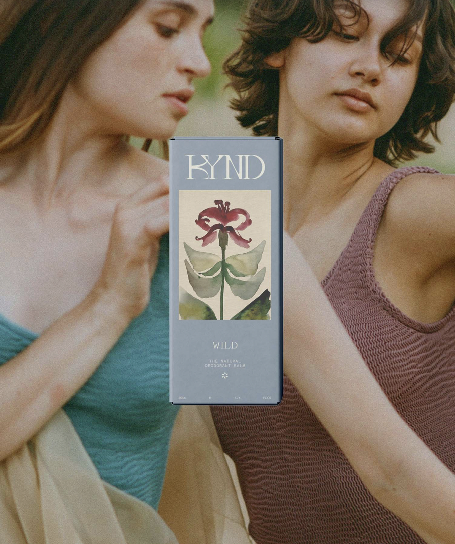
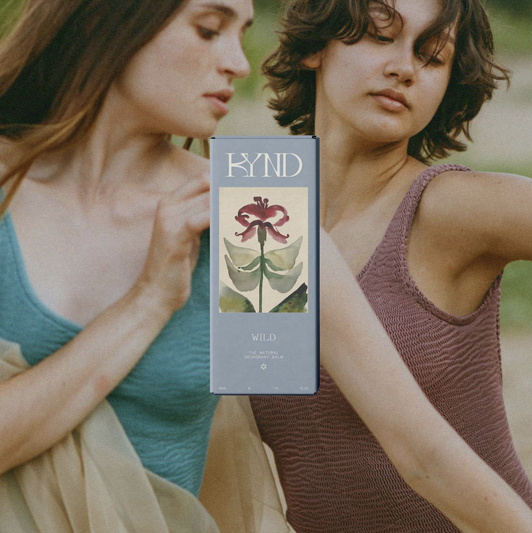
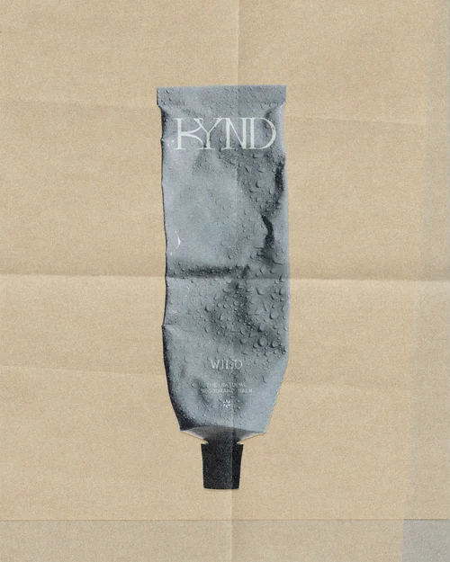
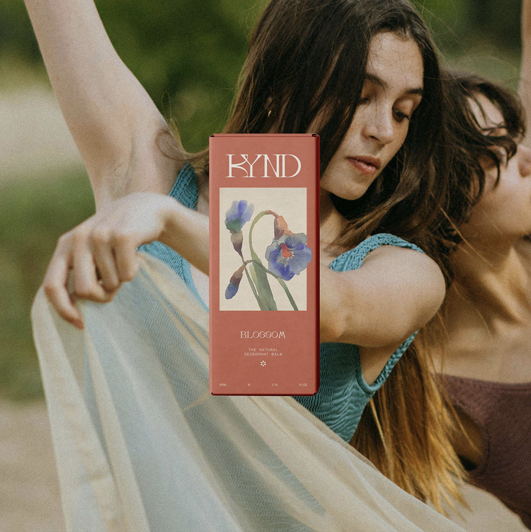
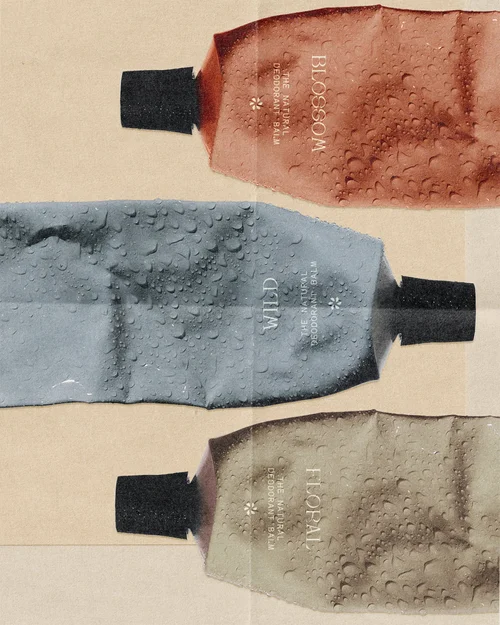
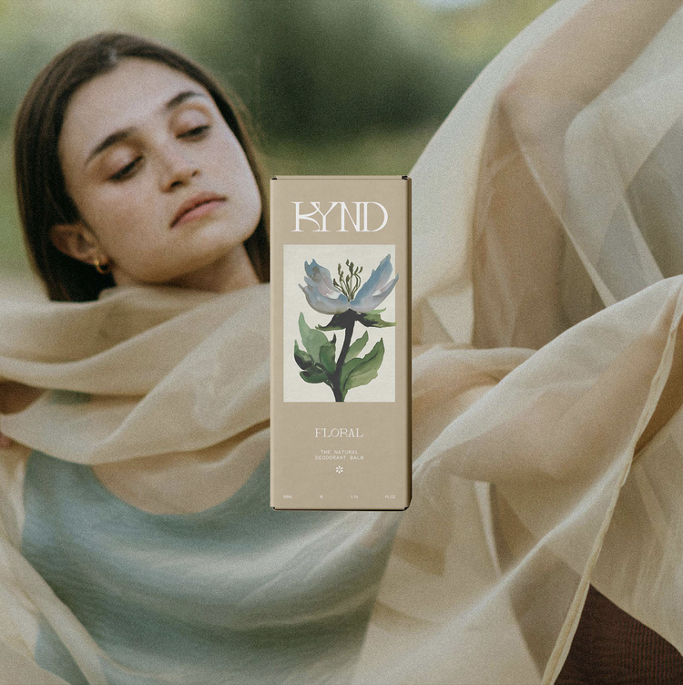
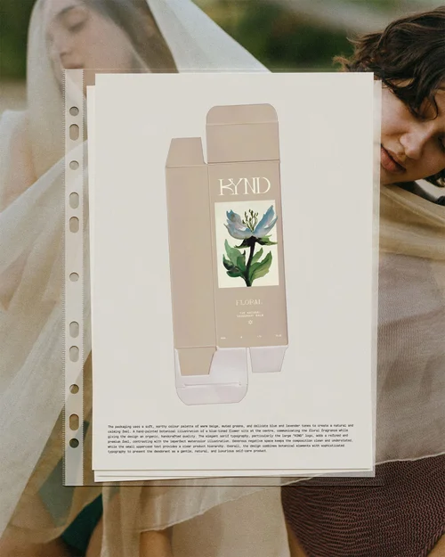
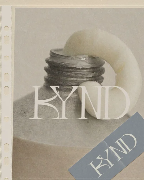
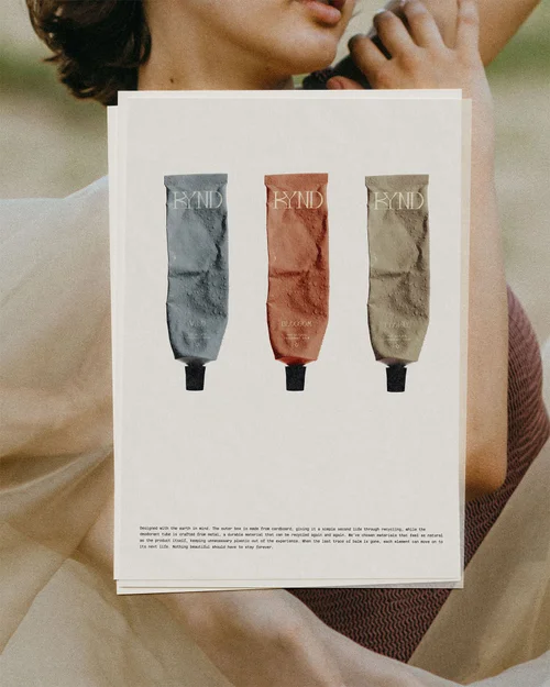
[01] [01] Packaging for Kynd, a natural deodorant balm. Custom typography meets a hand-painted watercolour botanical illustration, bringing a softer, more organic feel to the identity.I create Brand Identities and Websites for women entrepreneurs with a clear point of view, something meaningful to say, and a desire to do things differently.
Branding is more than a logo. It’s what makes you recognise something before you know why. The way type sits on a page, an image that catches your eye, a colour that stays with you, a detail you keep coming back to. I bring these elements together to create brand identities with a visual language all their own.
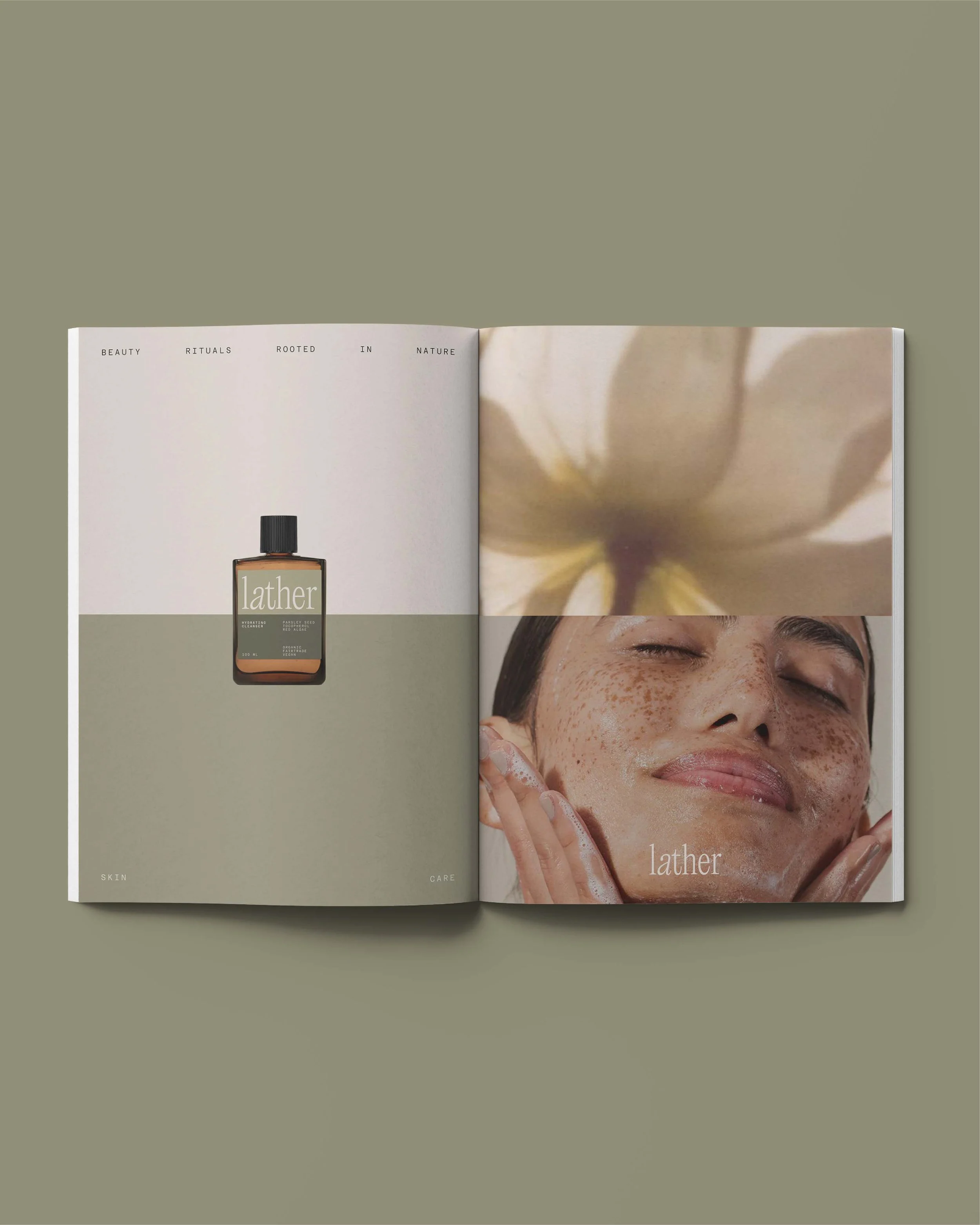
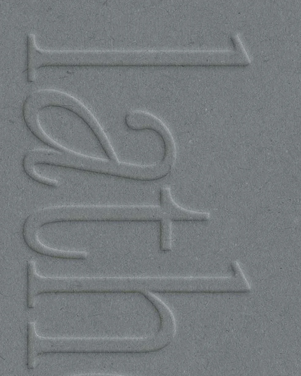
[02] [02] Lather is a beauty ritual brand rooted in nature, with lowercase typography, a soft visual aesthetic and a split art direction that brings balance to the identity.Let me guess. You already know how you want your brand to feel. You have a feeling, an idea you can almost picture in your head. What you don’t know is how to turn all of that into something that works.
That’s where I come in. I help you make sense of the vision. You bring all your ideas, references and half-formed thoughts. I listen, ask questions and find the thread that ties them together. Then I turn those pieces into the visual world of your brand.
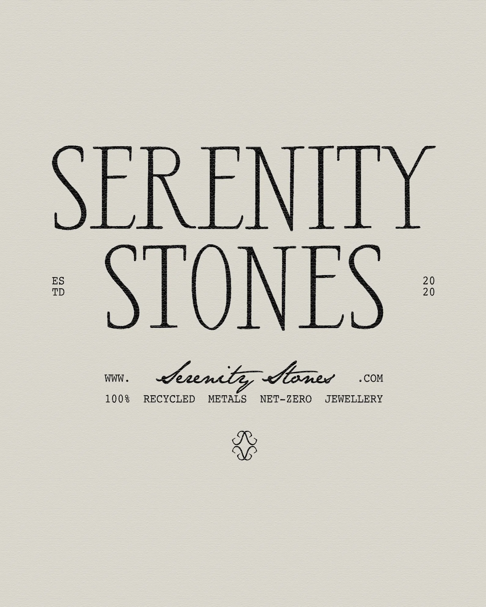
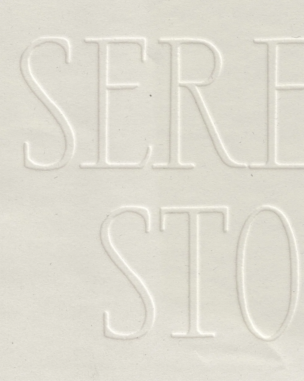
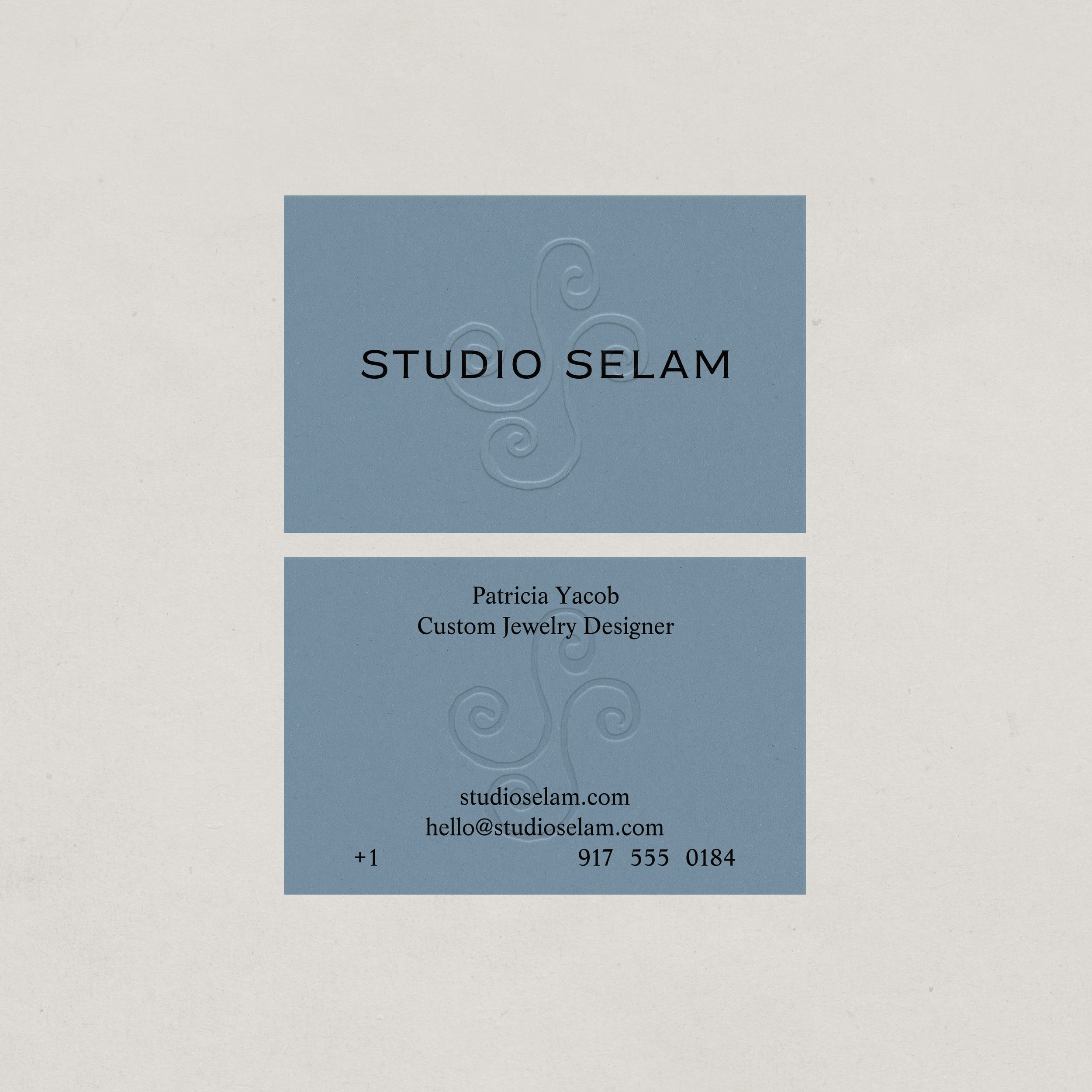
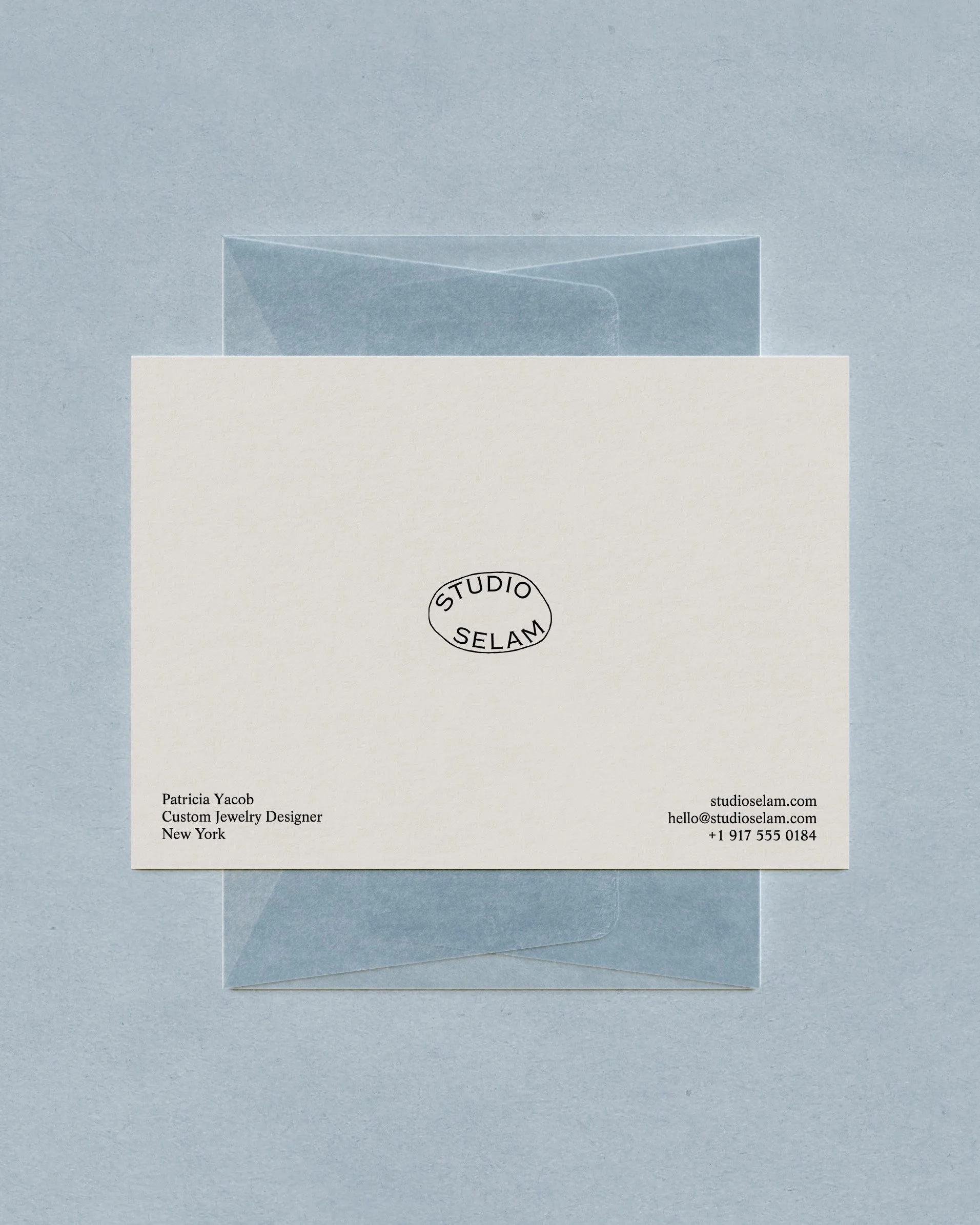
[03] The primary logo, drawn by hand to give Serenity Stones, a handcrafted jewellery brand using 100% recycled materials, a polished yet tactile feel. The art direction draws on nostalgia and romance, speaking to those who see jewellery as more than an accessory.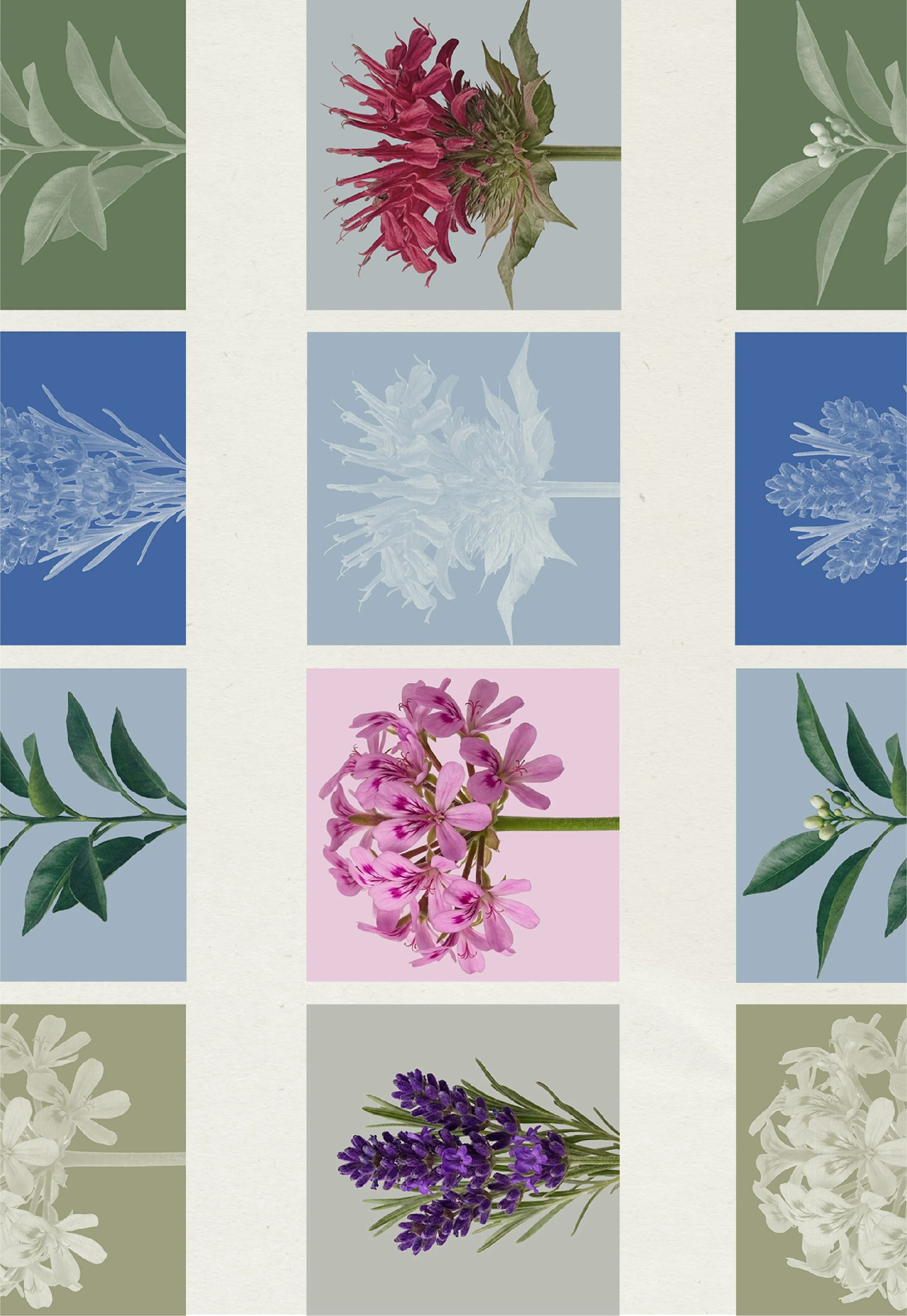
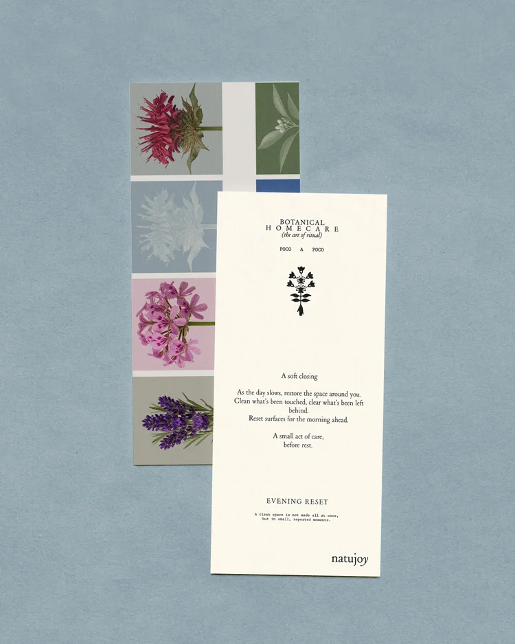
[04][04] Bespoke botanical tiles that create a distinctive visual language across packaging, digital and print for Natujoy. Reflecting the brand’s connection to nature and sensory wellbeing, the flexible system allows the tiles to evolve across products and campaigns while keeping the identity cohesive and recognisable.My role isn’t to decide what your brand should look like. It’s to understand what you’re trying to create, see where it can go, and bring it to life in a way that feels right. Something that makes sense. Something you can see yourself in. That moment when you look at it and think, “yes, that’s it”, that’s definitely my favourite part of the job.
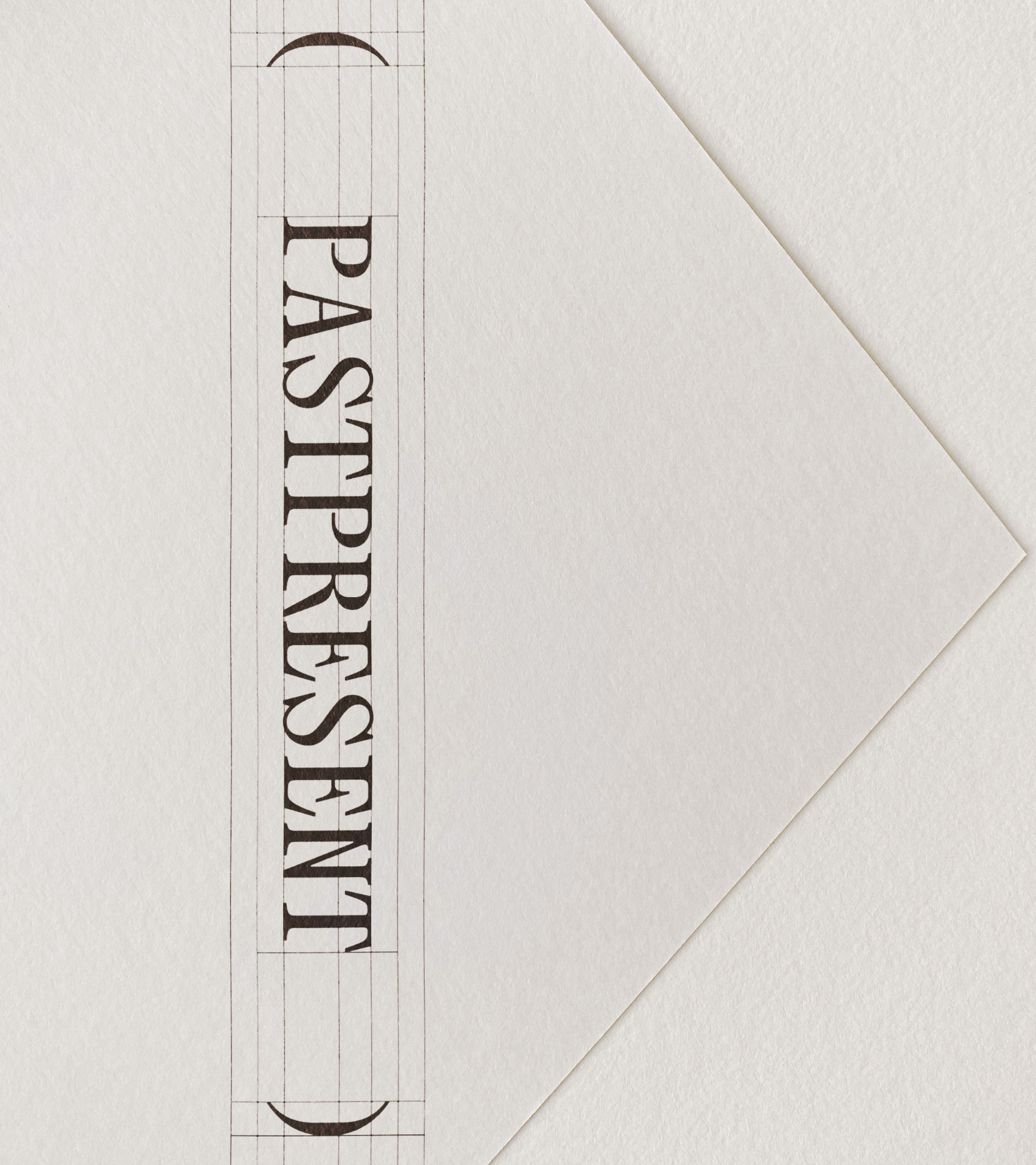
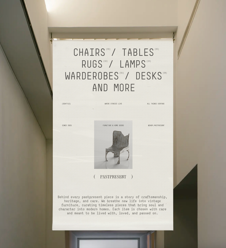
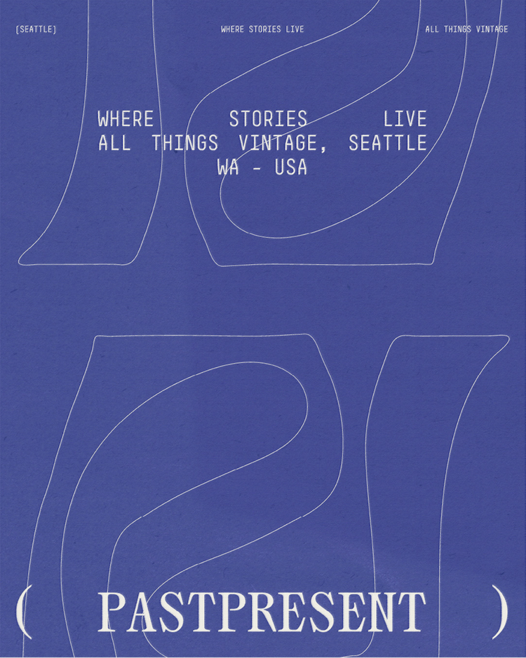
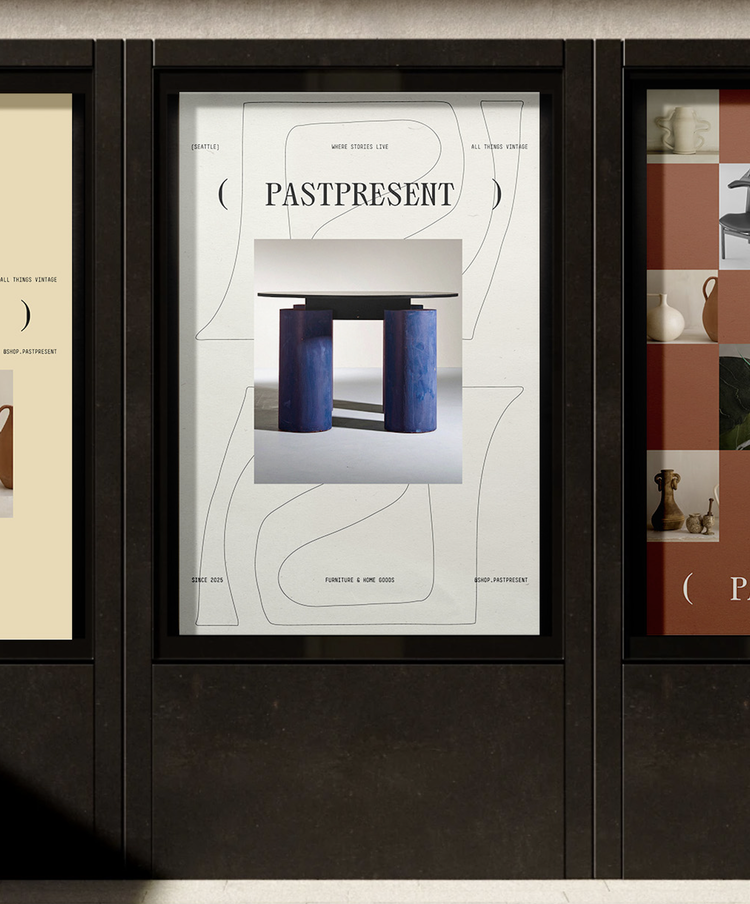
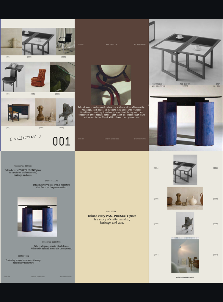
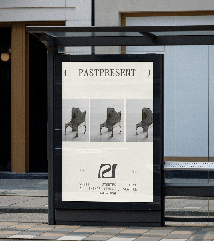
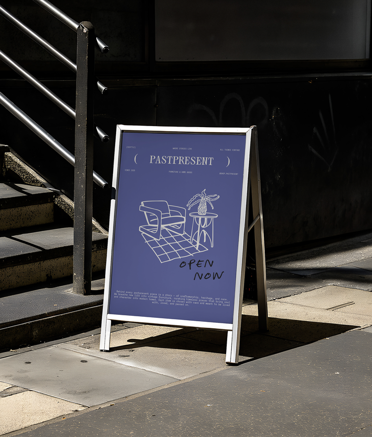
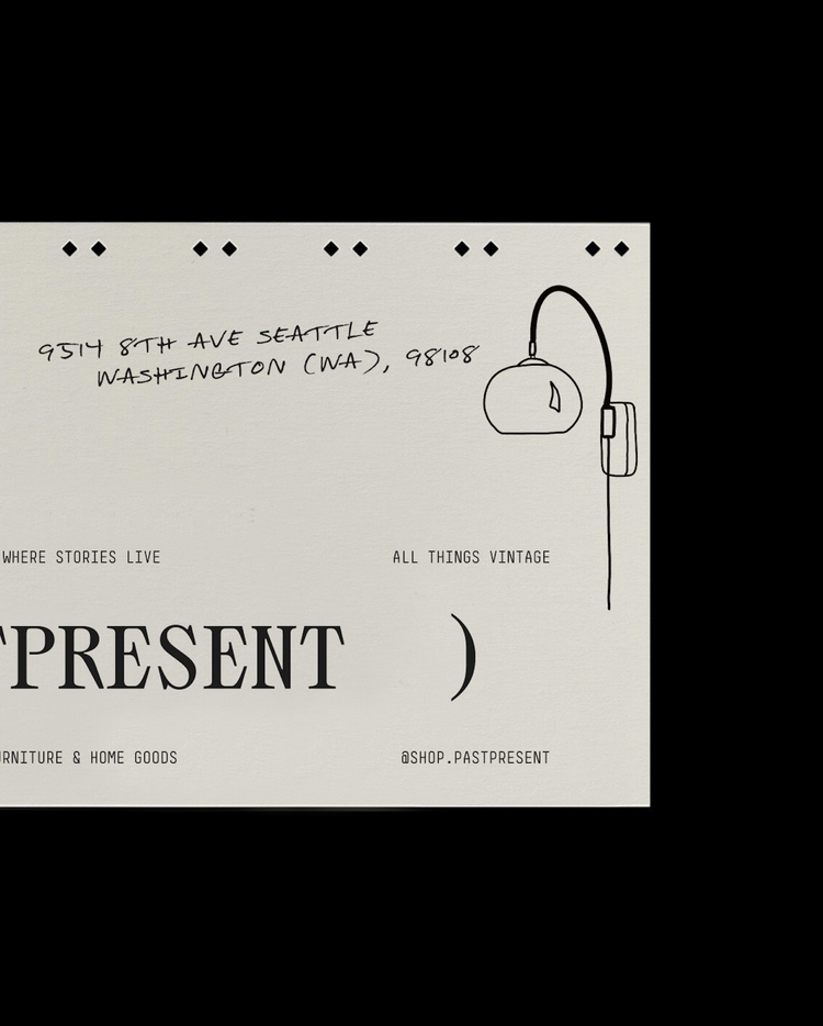
[05] Logo design for Pastpresent, a vintage furniture shop. Client
Services
Year
Natujoy
Brand Identity
Upcoming
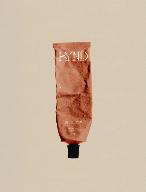
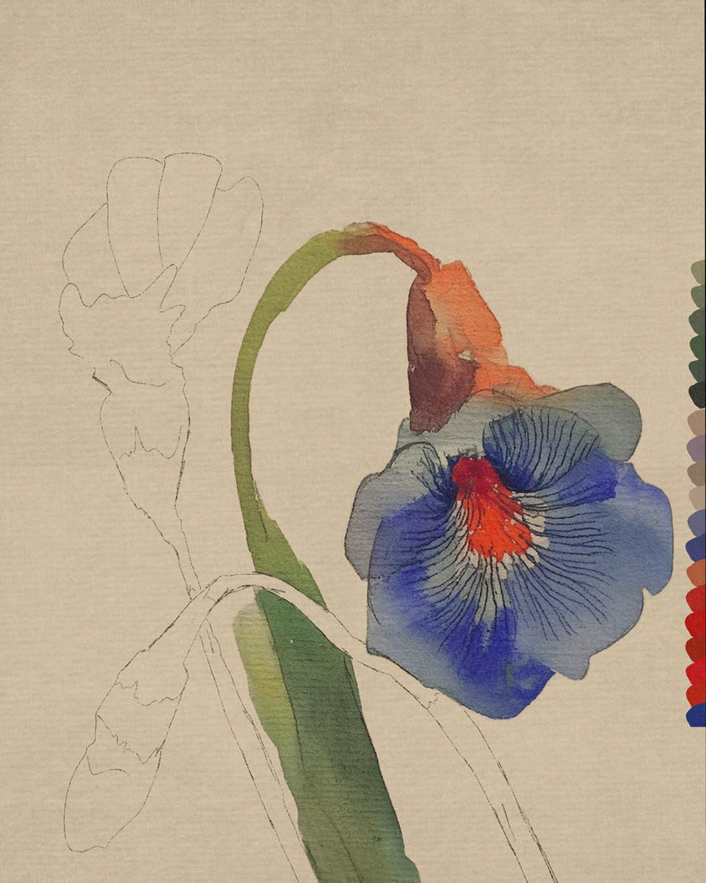
[06] [06] An in-progress study of the botanical watercolour illustration created for Kynd, a natural deodorant brand.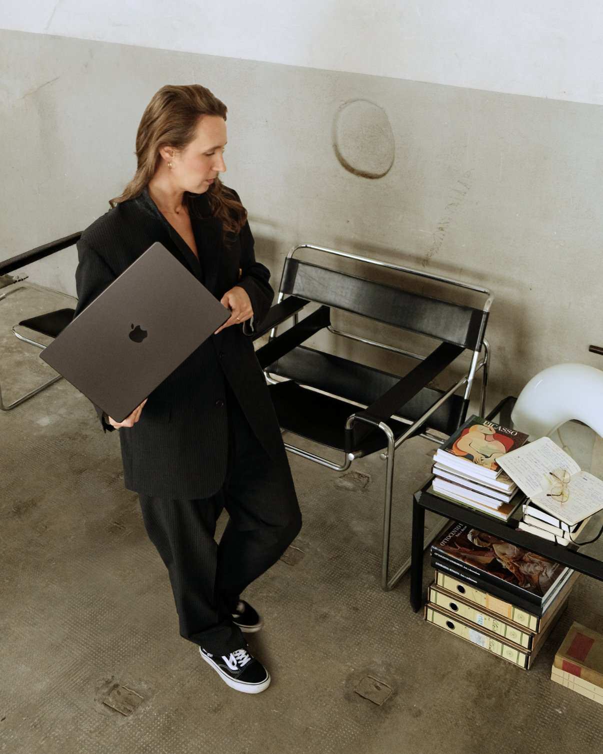
[07] Giulia, the designer and art director behind Amara.I believe you shouldn’t start with how a brand should look. You should start with what it needs to say. That’s where I begin. Strategy isn’t a box to tick before the creative starts. It’s what gives the creative somewhere to go. It helps us understand what matters, what doesn’t, and what the brand needs to say before we decide how it should look.
Then comes the creative part. It’s what makes people stop, look, remember and eventually fall in love. It turns the thinking into something people can see, feel and connect with. When strategy and creativity meet, that’s where the real work begins. From there, I build its world.
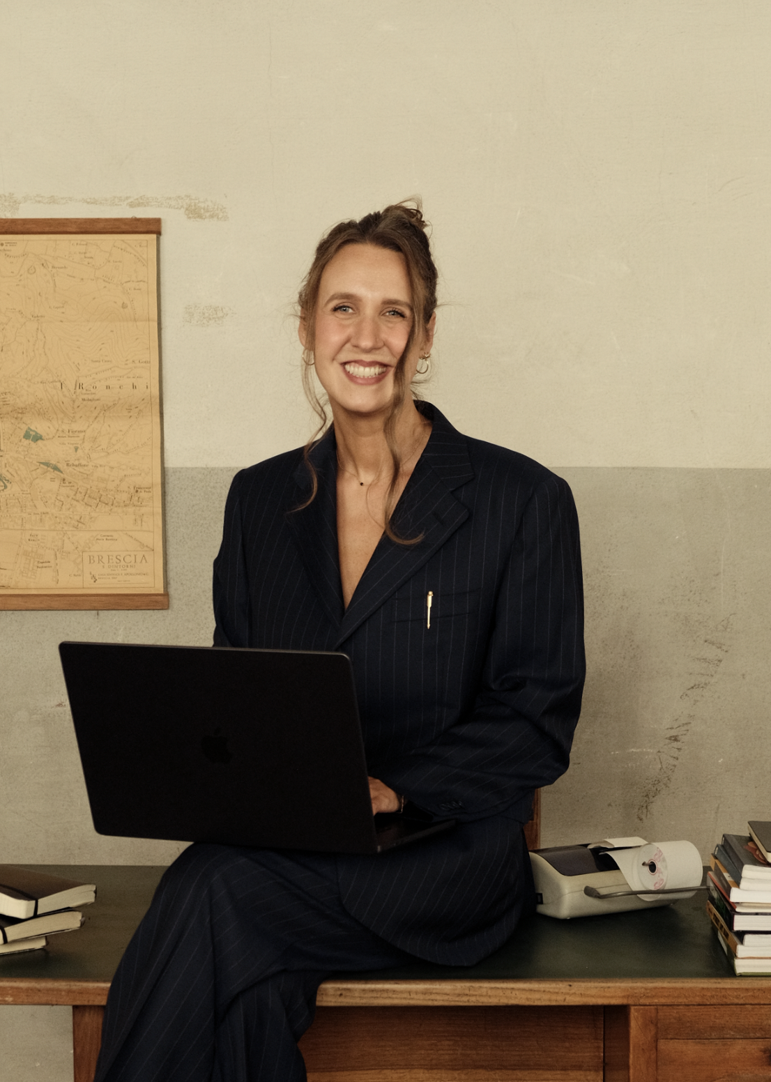
[08] [08] Giulia, the designer and art director behind Amara.More about me: I’m Giulia, the designer behind Amara. I studied graphic design at Central Saint Martins before spending over seven years as an Art Director at London agencies, working with global brands including Adidas, Starbucks, Suzuki, Samsung and Pandora.
In 2022, I left agency life behind, moved into a self-converted van and travelled the world. Somewhere along the way, my perspective on creativity and the work I wanted to do began to shift. I started working more closely with entrepreneurs who care deeply about what they’re building. That became Amara, a creative branding studio bringing together my love of design, art direction and storytelling.